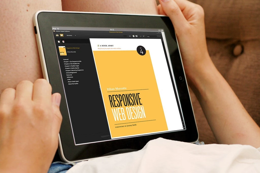
A responsive website design gives your travel agency the competitive edge it needs to convert leads into customers in an industry that is highly competitive. We have compiled a series below a series of things you can do to make your website design better. Take a look.

General Design:
Responsive images
- Do you need to use the image on your page? What role does it play? Is it part of the core content or is it just decorative?
- The rule of the thumb is that the lesser the images the faster the page will load.
- Use ImageOptim to optimize the images you use on your page
- To improve the performance of the images, enable zipping og files and expiry of headers for the static content.
- To ensure faster delivery of content, use Content Delivery Networks (CDNs) such as CloudFlare. They deliver your static content faster than your inhouse server to the users.
- Ensure you allow the browsers to use HTTP 2 features that enhance parallel requests.
- Enable conditional loading of your social media icons.
- Enable Google Maps to enhance your interactive images features.
Create a Responsive Typography for Your Website
- Ensure your font is appealing to the eye.
- Set the margins of your page design in such a way as to rhyme the vertical design of your page.
- Use deferred font loading to improve the performance of your page.
- Ensure your users can access the website functions and content easily regardless of which device they are using to access your site.
Progressive Enhancement
Task an expert to continually improve your website’s layout, graphics, content and SEO.
Layout
Check out the most popular website in your travel niche and copy their layout. There must be a reason why users and search engines love your website.
Forms:
Vertical Scroll Design –
To improve the usability of your website’s forms, ensure they can be completed in a linear format. Too many columns are a distraction. Besides, who what to keep doing horizontal scrolls to get to fill in their details after getting used to smartphones?
Fields Below the Label -
If your forms are going to be filled only on a tablet or a desktop, then the left alignment of labels is great. Unfortunately, most of the labels will be filled on smartphones with a small screen.
By placing the label above the field, you ensure that the users can see the maximum width of the field and thus determine what to input.
Tap Targets -
All your tap targets should be large regardless of the display size of the user’s device. The usability experience of your website will improve dramatically if the users don’t have to struggle with the tap targets.
Utilize HTML5 Forms Creatively -
HTML 5 give input hints to the user’s browser about the keyboard layout to show on the screen. Ensure your input types such as date, tel, url, email and number update automatically to match the user’s filling form and keyboard layout.
Utilize Flexbox Creatively -
Using HTML’s flexbox model rich formatting engine, complex layouts and engines have been made easy. Make your layout and forms beautiful using this manipulation tool!
Did you find this article helpful? Our consultants can help you create the best website design. Click here to talk to one of us.
What Do Your Travel Customers Really Need From You?
Understanding what your customers need from you makes you a super salesman!
14 Things that Your Customers Hate about Your Travel Ads
In the travel industry, people will mostly roll their eyes when you tell them you are an advertiser with a...
Things That Put-Off Prospective Customers
Which are those small things that you ignore but are responsible for losing your Travel Customers?
